 |
| November 25, 2014 | Volume 10 Issue 44 |
Designfax weekly eMagazine
Archives
Partners
Manufacturing Center
Product Spotlight
Modern Applications News
Metalworking Ideas For
Today's Job Shops
Tooling and Production
Strategies for large
metalworking plants
Word processing: A few simple guidelines for designing text on plastic parts
By Gus Breiland, Customer Service Engineering Manager, Proto Labs
There are lots of reasons to add text to a part. It could be an assembly instruction, a part number, a legally advisable warning, or simply a logo. Whatever the reason, text characters tend to be the smallest features of a part and, as such, deserve the designer's careful attention.
The first thing to keep in mind is that it works much better if text on a plastic part is raised above, rather than recessed into, the part (which means it will be milled into the mold). Raised letters on a part are easier to read, and recessed text in a mold allows for polishing, whereas raised letters in a mold make it difficult to achieve a good finish.
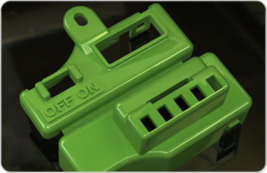
Figure 1: Off/On switch instructions on a part.
The second issue is consistency of wall size in your lettering. Avoid serif fonts, the ones with the little squiggles at the ends of uprights. The serifs are typically narrower than the primary lines of the letter itself, making them too small to mill. Instead, use a sans-serif (non-serif) font like Century Gothic Bold (the default font in SolidWorks). Other common sans-serif fonts are Arial and Verdana. In general, remember that while most 3D CAD programs allow you to use standard Windows fonts, you should resist the temptation to get cute without a good reason.
The third issue is the size of the letters themselves (see Figures 2 and 3). Text doesn't need to stand very tall above the surface of a part -- 0.02 in. is plenty -- but even so, the rules for thin ribs apply. You don't need to measure the thickness of every line of each letter; just stick to font sizes of 20 points or more and use the Bold version of the font, and odds are excellent it can be milled. In some cases, we can mill smaller fonts. If you need to do so, upload the part with the smaller text for a ProtoQuote interactive quote and the quote will show any required changes or advisories. You can also contact a Proto Labs Customer Service Engineer at 763.479.3680 to discuss your project.
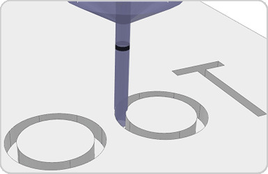
Figure 1: Off/On switch instructions on a part.
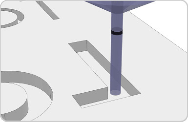
Figure 3: The "L" is a larger font size and allows room for the tool to mill.
Finally, if text is located at the top of a tall feature -- a tall rib, for example -- the text may have to be larger. For best results when incorporating text:
- Design your parts with raised text.
- Use a bold sans-serif font.
- Size text to 20-point type or larger.
- Stay away from the tops of tall features.
Published November 2014
Rate this article
View our terms of use and privacy policy